MantisBT - ParaView |
| View Issue Details |
|
| ID | Project | Category | View Status | Date Submitted | Last Update |
| 0015652 | ParaView | (No Category) | public | 2015-08-13 18:35 | 2016-01-08 15:32 |
|
| Reporter | Ken Moreland | |
| Assigned To | Utkarsh Ayachit | |
| Priority | normal | Severity | minor | Reproducibility | have not tried |
| Status | closed | Resolution | fixed | |
| Platform | | OS | | OS Version | |
| Product Version | git-master | |
| Target Version | 5.0 | Fixed in Version | 5.0 | |
| Project | Sandia |
| Topic Name | |
| Type | incorrect functionality |
|
| Summary | 0015652: Quartile chart is wrong |
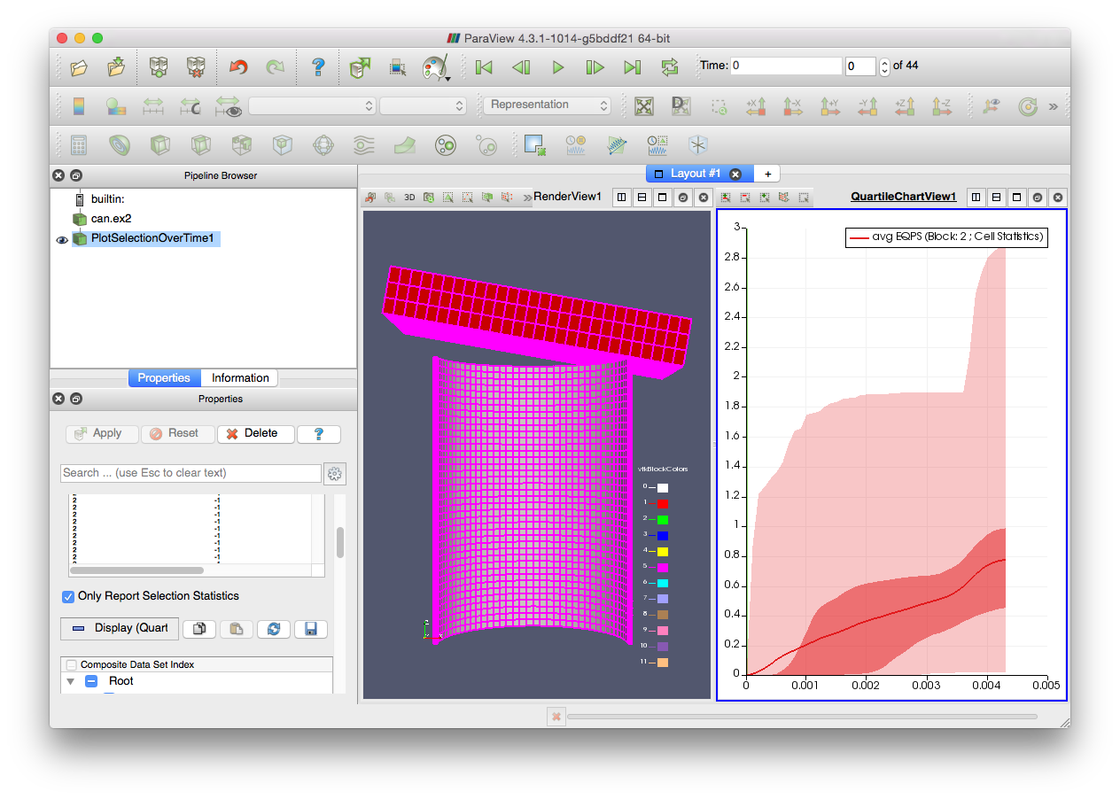
| Description | When you plot a large selection over time with the selection statistics on, you get a quartile chart that is clearly wrong. To replicate, do the following:
1. Open can.ex2. Load all variables. Apply.
2. Use a select cell through to select everything.
3. Open the Find Data dialog.
4. Click Freeze Selection.
5. Click Plot Selection Over Time.
6. Turn on "Only Report Selection Statistics". Apply.
In the resulting quartile chart you can see that the average line in the lower left is drawn in the upper quartile, which is clearly wrong. (See the attached image.) Either the plot selection over time filter is computing bad statistics or the quartile chart is plotting it wrong. |
| Steps To Reproduce | |
| Additional Information | |
| Tags | No tags attached. |
| Relationships | |
| Attached Files |  Screen Shot 2015-08-13 at 4.34.39 PM.png (208,592) 2015-08-13 18:35 Screen Shot 2015-08-13 at 4.34.39 PM.png (208,592) 2015-08-13 18:35
https://www.vtk.org/Bug/file/9871/Screen%20Shot%202015-08-13%20at%204.34.39%20PM.png
|
|
| Issue History |
| Date Modified | Username | Field | Change |
| 2015-08-13 18:35 | Ken Moreland | New Issue | |
| 2015-08-13 18:35 | Ken Moreland | File Added: Screen Shot 2015-08-13 at 4.34.39 PM.png | |
| 2015-08-17 16:16 | Alan Scott | Project | TBD => Sandia |
| 2015-08-17 16:16 | Alan Scott | Note Added: 0035009 | |
| 2015-08-17 16:16 | Alan Scott | Target Version | => 4.5 |
| 2015-08-18 11:59 | Ken Moreland | Note Added: 0035017 | |
| 2015-09-11 16:44 | Utkarsh Ayachit | Target Version | 4.5 => 5.1 |
| 2015-11-09 13:32 | Utkarsh Ayachit | Note Added: 0035438 | |
| 2015-11-09 14:01 | Utkarsh Ayachit | Note Added: 0035439 | |
| 2015-11-09 14:01 | Utkarsh Ayachit | Status | backlog => gatekeeper review |
| 2015-11-09 14:01 | Utkarsh Ayachit | Fixed in Version | => git-master |
| 2015-11-09 14:01 | Utkarsh Ayachit | Resolution | open => fixed |
| 2015-11-09 14:01 | Utkarsh Ayachit | Assigned To | => Utkarsh Ayachit |
| 2015-11-17 14:23 | Utkarsh Ayachit | Status | gatekeeper review => customer review |
| 2015-11-17 14:24 | Utkarsh Ayachit | Note Added: 0035456 | |
| 2015-11-17 14:24 | Utkarsh Ayachit | Note Edited: 0035456 | bug_revision_view_page.php?bugnote_id=35456#r1399 |
| 2015-12-16 17:14 | Alan Scott | Note Added: 0035583 | |
| 2015-12-16 17:14 | Alan Scott | Status | customer review => closed |
| 2016-01-08 15:31 | Utkarsh Ayachit | Target Version | 5.1 => 5.0 |
| 2016-01-08 15:32 | Utkarsh Ayachit | Fixed in Version | git-master => 5.0 |
|
Notes |
|
|
(0035009)
|
|
Alan Scott
|
|
2015-08-17 16:16
|
|
|
Ken, Think it is OK to fix this next release (not this release)? |
|
|
|
(0035017)
|
|
Ken Moreland
|
|
2015-08-18 11:59
|
|
Alan, that depends on the root cause of the problem. If ParaView is giving us bad values then it should be fixed the next release, but if this is just an odd interaction then I'm fine with pushing it back.
After giving this some thought, I suspect it is probably the latter. I think what is happening is that the quartiles are based on the distribution of the data. The median value by definition should always be between the two middle quartiles. However, the thick line is the average, not the median, which is slightly different. I suspect that in early timesteps you have a small set of values that are very large, which is bringing the average noticeably above zero even though more than 50% of the value are still zero (thus the median is zero).
Assuming this is the case, I am fine with pushing the fix off.
I'm not sure what the right answer is here. I don't think replacing the average with median is a good answer. Maybe we could have a second thinner and more subtle line showing the median. That should be easy to implement. |
|
|
|
(0035438)
|
|
Utkarsh Ayachit
|
|
2015-11-09 13:32
|
|
|
Ken, your analysis is correct. The average needn't lie between the two middle quartiles. I can add a median line and also add checkboxes on the panel allow using to toggle visibility of both of these lines. |
|
|
|
(0035439)
|
|
Utkarsh Ayachit
|
|
2015-11-09 14:01
|
|
|
|
|
(0035456)
|
|
Utkarsh Ayachit
|
|
2015-11-17 14:24
|
|
Added ability to show median line as well as average line.
|
|
|
|
(0035583)
|
|
Alan Scott
|
|
2015-12-16 17:14
|
|
Spectacular.
Tested remote server, Linux, 5.0.0-RC2. |
|